写过前端的人一定不会对 CSS 3 中的弹性盒子布局(Flexible Box Layout)陌生吧。这篇文章介绍了如何在 Android 中使用 Google 推出的 FlexboxLayout 实现标签控件。
需求
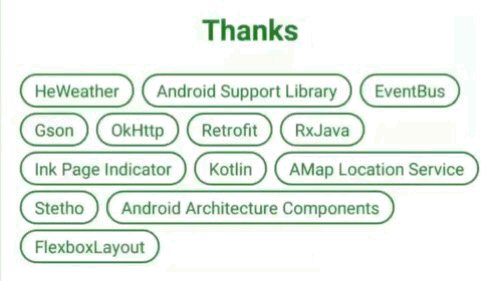
在设计 Cold 的关于界面时,想到需要将使用到的服务或开源库列出来。觉得使用列表的方式不好看,看到很多 app 和网站中热门标签的设计,想到可以使用标签的方式来呈现,就在 Sketch 上画好了(我只是个 UI 设计小白):
高亮的这一块,就是标签控件了,那么如何来实现呢?
分析
CSS 3 中的 Flexible Box Layout 是个很好用的布局,可以根据屏幕宽度调整容器中每一行显示元素的数量,当一行结束的位置显示不下某个元素时,该元素会被移至下一行的起始位置。
在网上查了一下,有很多篇关于这样控件的实现方式的文章,大多都叫“FlowLayout”(流式布局)。但是,这些开源库基本上都是继承 ViewGroup,在其中调整子控件的布局,当某一行的所有控件宽度之和大于该 ViewGroup 的宽度时,将该行结束位置的控件移动到下一行的起始位置,这样的话需要在 xml 布局文件中使用 ViewGroup 的方式来写,明显这样的控件里面的子控件可以互不相同。然而在需求中可以看到,所有的标签都是一样的,使用 TextView 加 Shape 作为背景就行,也就是说我得写一大堆有相同背景而只有文本不同的 TextView,有点小题大做的感觉,这就应该用集合布局 + 适配器(e.g. RecyclerView + Adapter)的方式来实现嘛。
后来猛然想起以前好像看过一篇关于 Google 开源的弹性盒子布局(当时想不起来具体叫什么名字了)的文章,立马去搜,还真让我搜到了,就是 FlexboxLayout。更惊喜的是,除了提供上面说的那种 ViewGroup 的方式,还提供了 RecyclerView 的方式,使用 LayoutManager 即可,这就是这篇文章的主角啦。
实现
在模块级 build.gradle 文件中添加:
dependencies {
    ...
    implementation 'com.google.android:flexbox:1.0.0'
}
FlexboxLayout 有两种使用方式,ViewGroup 方式和 LayoutManager 方式,主要关注第二种。
LayoutManager 决定了 RecyclerView 中子布局的排列方式,而 FlexboxLayoutManager 正是指定子布局按弹性盒子的方式排列。FlexboxLayoutManager 有多个属性,可以指定排列方向等,默认是从左到右、从上到下多行排列,因此,根据需求,直接使用默认设置即可。
首先在布局文件中写一个 RecyclerView:
<android.support.v7.widget.RecyclerView
    android:id="@+id/vLibraryLabel"
    android:layout_width="match_parent"
    android:layout_height="wrap_content"/>
在 Activity 中引用该 RecyclerView,将它的 LayoutManager 设置为 FlexboxLayoutManager:
vLibraryLabel.layoutManager = FlexboxLayoutManager(this)
由于不需要设置 FlexboxLayoutManager 的其他属性,直接使用只有一个参数的构造函数。
注意:在布局文件中使用
app:layoutManager="com.google.android.flexbox.FlexboxLayoutManager"
指定 LayoutManager 无效(版本 1.0.0)。
然后,在 drawable 资源目录中添加文件 bg_library_item_base.xml,指定每个标签的背景:
<shape xmlns:android="http://schemas.android.com/apk/res/android">
    <!-- 边框宽度与颜色 -->
    <stroke
        android:width="1.5dp"
        android:color="@color/colorPrimary"/>
    <!-- 圆角半径 -->
    <corners android:radius="16dp"/>
</shape>
@color/colorPrimary 引用了基础色。
在 layout 资源目录中添加文件 item_label_library.xml,指定每个标签的布局:
<TextView
    xmlns:android="http://schemas.android.com/apk/res/android"
    android:id="@+id/vLibraryText"
    android:layout_width="wrap_content"
    android:layout_height="wrap_content"
    android:textColor="@color/colorPrimary"
    android:background="@drawable/bg_library_item_base"
    android:paddingTop="4dp"
    android:paddingBottom="4dp"
    android:paddingStart="12dp"
    android:paddingEnd="12dp"/>
写一个适配器 LibraryLabelAdapter:
class LibraryLabelAdapter : RecyclerView.Adapter<LibraryLabelAdapter.ItemViewHolder>() {

    private val libraries = arrayOf(
            Pair("HeWeather", "https://www.heweather.com"),
            ...
    )

    override fun onCreateViewHolder(parent: ViewGroup, viewType: Int) =
            ItemViewHolder(LayoutInflater.from(parent.context).inflate(R.layout.item_label_library, parent, false))

    override fun onBindViewHolder(holder: ItemViewHolder, position: Int) {
        val (name, link) = libraries[position]
        holder.vLibraryText.text = name
        holder.itemView.setOnClickListener {
            // 点击标签打开链接
            val intent = Intent(Intent.ACTION_VIEW, Uri.parse(link))
            if (intent.resolveActivity(activity.packageManager) != null) {
                activity.startActivity(intent)
            }
        }
    }

    override fun getItemCount() = libraries.size

    class ItemViewHolder(override val containerView: View) : RecyclerView.ViewHolder(containerView), LayoutContainer
}
在 Activity 中将 RecyclerView 的 Adapter 设置为 LibraryLabelAdapter:
vLibraryLabel.adapter = LibraryLabelAdapter()
标签之间需要有一定距离才美观。如果在每个标签的布局上使用 layout_margin 属性的话,四周也会有分隔,而只是要求在标签之间添加分隔,因此应该使用 RecyclerView 的 ItemDecoration。而 FlexboxLayout 提供了一个 FlexboxItemDecoration,可以用来在标签之间添加分隔区域。
在 drawable 资源目录中添加文件 bg_library_divider.xml,指定分隔区域的背景:
<shape xmlns:android="http://schemas.android.com/apk/res/android">
    <!-- 透明背景 -->
    <solid android:color="@android:color/transparent"/>
    <!-- 横向分隔区域的宽与纵向分隔区域的高 -->
    <size
        android:width="6dp"
        android:height="4dp"/>
</shape>
在 Activity 中设置 RecyclerView 的 ItemDecoration:
val libraryItemDecoration = FlexboxItemDecoration(this)
libraryItemDecoration.setDrawable(getDrawable(R.drawable.bg_library_divider))
vLibraryLabel.addItemDecoration(libraryItemDecoration)
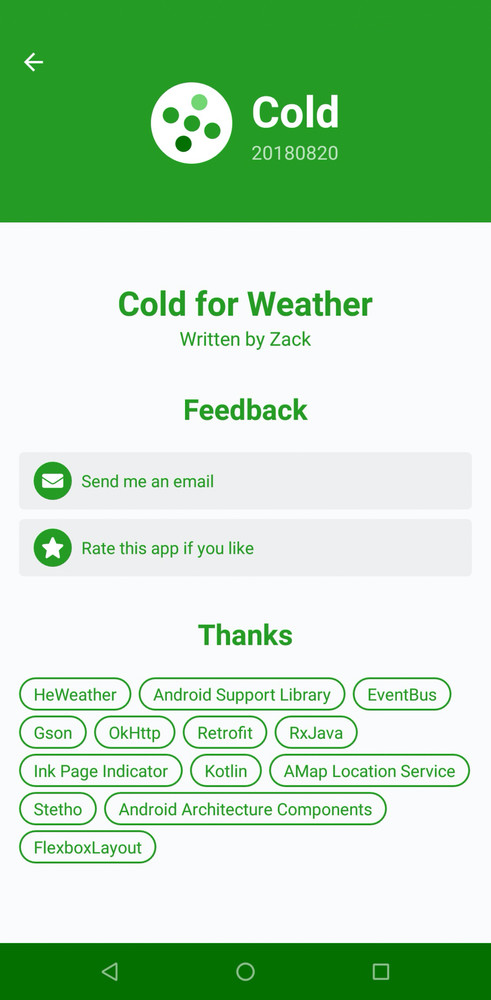
搞定啦:
Bonus:为标签设置水波纹触摸效果
上面的标签是没有触摸效果的,这不能给用户很好的反馈。而 Material Design 中,触摸效果一般会做成水波纹效果(Ripple Effect)。
在 drawable 资源目录中添加文件 bg_library_item_mask.xml,指定水波纹效果的蒙版,当按住标签的时候,该文件中定义的 Shape 就会显现出来,所以应该是实心(solid)的:
<shape xmlns:android="http://schemas.android.com/apk/res/android">
    <!-- 实心颜色 -->
    <solid android:color="@android:color/black"/>
    <!-- 圆角半径 -->
    <corners android:radius="16dp"/>
</shape>
其中,实心颜色与水波纹颜色没什么关系(只要不是透明的就行,经测试,透明的话会导致水波纹无颜色),圆角半径则与 bg_library_item_base.xml 中的相同。
再在 drawable 资源目录中添加文件 bg_library_item.xml,指定水波纹效果:
<ripple
    xmlns:android="http://schemas.android.com/apk/res/android"
    android:color="@color/colorPrimaryLight">
    <!-- 蒙版 -->
    <item
        android:id="@android:id/mask"
        android:drawable="@drawable/bg_library_item_mask"/>
    <!-- 背景 -->
    <item android:drawable="@drawable/bg_library_item_base"/>
</ripple>
其中,ripple 标签中的 android:color 属性指定水波纹颜色,这里使用 @color/colorPrimaryLight 引用了浅基础色。其中有两个 item 标签,第一个使用 android:id="@android:id/mask" 指定该 item 为蒙版,在按住标签时显现,android:drawable 属性为上面定义的蒙版文件;第二个指定背景,始终显示,android:drawable 属性为之前定义的背景文件。
最后,修改 item_label_library.xml,将 android:background 属性更改为 @drawable/bg_library_item。
效果如图: